Struggling with an icon (as one does). The struggle here is that the check mark is common for “ok/ready/done”. In Sweden it has historically been used to mark wrong answers on tests. The opposite, really. So now I need more understanding on how big of a conflict this really is.
(View Tweet)
Not looking for help Twitter guidance, just sharing a struggle that has roots in cultural differences where a small country is also heavily influenced by the culture of a bigger country with differing mental models.
Reminds me of my dissertation on translation in fiction. (View Tweet)
Rabbit hole. Here we go:
In Sweden, correct answers were traditionally marked with an “R” for “Rätt”.
In Finland, ✓ often stands for väärin, i.e., “wrong”, due to its similarity to a slanted v. (View Tweet)
In Japan, the O mark is used instead of the check mark, and the X or ✓ mark are commonly used for wrong.
Also known as Marujirushi (丸印) in Japan and Gongpyo (공표(공標), ball mark) in Korea, the symbols ”◯” or ”⭕” are used to represent affirmation in East Asia. (View Tweet)
In the Netherlands a ‘V’ is used to show that things are missing while the flourish of approval (or krul) is used for approving a section or sum.
Today I learned about “the flourish of approval”!
(View Tweet)
The plot thickens. There is a symbol called “dele” or “deleatur”. It is eerily similar to the Dutch “krul” (flourish of approval).
But, the “dele” – as the name implies – means that something is marked for deletion. So actually not approved.
https://t.co/ad60rmOXdV (View Tweet)
Here’s a photo showing the Dutch “krul”, or “goedkeuringskrul” as the long name appears to be, being used to grade student work. For questions 9 and 10 you can see how a check mark is used to indicate a wrong answer.
https://t.co/2hm4PnMTPW (View Tweet)
A picture of a graded Swedish assignment would look extremely similar.
The difference is that the “krul” would be a cursive “R”. Which also is not far from how the krul looks, as has been pointed out by others. The check mark for wrong answers would be exactly the same. (View Tweet)
If you speak Swedish, “godkeuringskrul” could be translated as “godkännandekrull” or “godkännandekringla”. An approval ‘curl’ or ‘squiggle’. (View Tweet)
This piqued some interest so I’ll summarize where I am right now. The icon I was working on is related to healtchare and at-home-testing kits for covid 19. An icon would follow between physical and digital objects to indicate to the person they’re in the right place. (View Tweet)
Because of constraints it necessarily has to be small. There is a proposed icon for the testing kit itself. To indicate that it is ready for pickup, the idea was to add a checkmark. (View Tweet)
I would not have worried much about this had I not been aware that a significant number of users will be elderly and internet novices. The people who, I hypothesize, are most likely to associate the check mark with ”wrong”. (View Tweet)
Given this risk, and the fact that there is not enough time to do reliable research, I am wary of adding the check mark. An alternative may be the letters ”OK”. (View Tweet)
As this will be used on printed instructions accompanying each testing kit, it’s not an easy change post-decision.
But this insight provided by @alundbergh actually proved really helpful. A checkmark in a box, rather than standalone, carries more meaning. https://t.co/3p4ct9b6wP (View Tweet)
In short, I am not ready to finalize the icon. I have a few more days. I will try and remember to follow up here. :) But learning more about right/wrong indicators in different cultures will definitely come in useful in many situations ahead. (View Tweet)

 (View Tweet)
 (View Tweet)
 (View Tweet)
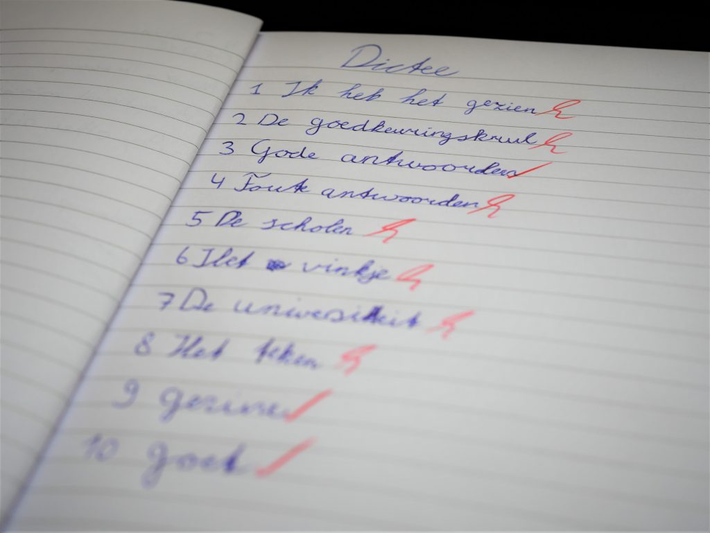 (View Tweet)